Flexbox
Flexbox tips, tricks and properties overview.
Columns
.columns {
  display: flex;
  flex-wrap: wrap;
  max-width: 1500px;
  margin: auto;
  padding: 1em 2.5%;
}
.columns > div {
  flex-basis: 18.5em;
  flex-grow: 1;
}
Item Margin
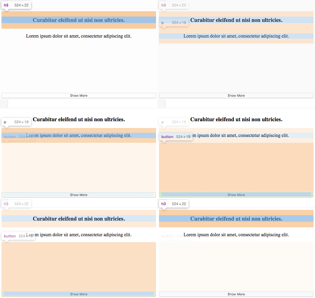
Scenario, you have a few block level elements stacked in a container with height, and the last of these needs to be at the bottom of the container.
If there are only two elements, justify-content:space-between; would work. However, this solution is for three or more elements and all but the last are in their normal positions.
Use display:flexbox on the container element with flex-direction:column; to stack the flexbox item elements vertically. Then on the last element that is to align on the bottom, use margin-top:auto;. When using flex-direction:column;, margin:auto behaves vertically the same as it does horizontally.
Experiment with the flexbox-item-margin example in our sandbox.
Properties
Parent element (flex container)
Apply these properties to the parent element.
display
All direct child elements will be flex items.
display: flex;
display: inline-flex;
flex-direction
Sets the main-axis.
flex-direction: row; //default
flex-direction: row-reverse;
flex-direction: column;
flex-direction: column-reverse;
| A | B | C |
| A |
| B |
| C |
flex-wrap
flex-wrap: nowrap; //default
flex-wrap: wrap;
flex-wrap: wrap-reverse;
justify-content
justify-content: flex-start; //default
justify-content: flex-end;
justify-content: start;
justify-content: end;
justify-content: left;
justify-content: right;
justify-content: center;
justify-content: space-between;
justify-content: space-around;
justify-content: space-evenly;
align-items
align-items: stretch; //default
align-items: end;
align-items: center;
align-items: baseline;
...
align-content
For the cross-axis.
align-content: flex-start;
align-content: flex-end;
align-content: center;
align-content: stretch;
align-content: space-between;
align-content: space-around;
align-content: space-evenly;
Note: this property has no effect when only one line of flex items.
Child elements (flex items)
Apply these properties to the direct children of the parent element.
order
order: 2 //default = 0
flex-grow
flex-grow: 2 //default = 0
| 1 | 1 | 1 |
For example, if one of the children has a value of 2, it will try to take up twice as much space as the others.
| 1 | 2 | 1 |
flex-shrink
flex-shrink: 2 //default = 1
flex-basis
The default size of an element before the remaining space is distributed.
flex-basis: 25%; //default auto
NOTE: flex-grow: 1 or greater can override flex-basis.
flex
Shorthand for flex-grow, flex-shrink and flex-basis. flex-shrink and flex-basis are optional.
flex: 0 1 auto; //default
flex: 2 2 25%;
It is recommended that you use this shorthand property instead of the individual properties since it sets the other values intelligently.
align-self
Override parent align-items property for individual flex items.
align-self: auto;
align-self: flex-start;
align-self: flex-end;
align-self: center;
align-self: baseline;
align-self: stretch;
Resources

