
ADOBE EXPERIENCE MANAGER (AEM) COMPONENTS
Folding Panel Component
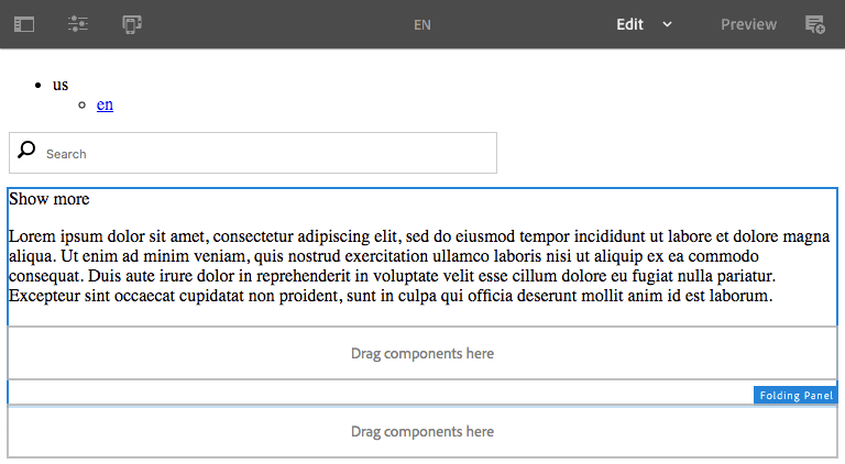
An Adobe Experience Manager (AEM) example to demonstrate development of a simple folding panel component to show or hide content by clicking the panel’s label element. AEM components can be added by an author to populate the folding panel content.
Features
- CSS only, no JavaScript is needed to open or close the panel when clicking the Title.
- A parsys is used to add or remove components from within the panel contents.
Getting Started
As with most AEM projects, we’re using a Maven project archetype for this. You could develop the component and clientlib directly in CRXDE Lite if you prefer since there will not be a Java code bundle dependency. However, If you do not have an existing AEM Maven project to work with, I highly recommend you use one. This AEM Maven Project series can guide you through the setup process.
Copying the existing
helloworldcomponent included with the archetype is an easy way to jump start development. Simply copyhelloworldand rename itfoldingpanel.
Component Folder
Update the copy of helloworld, or in the the components/content folder of your project, e.g., /apps/myproject/components/content/ create a folder named foldingpanel.
In order for this to be a component, there are properties that need to be assigned to the foldingpanel folder. Within the folder, create a .content.xml file as follows for this. Update the componentGroup property as needed.
.content.xml
<?xml version="1.0" encoding="UTF-8"?>
<jcr:root xmlns:cq="http://www.day.com/jcr/cq/1.0" xmlns:jcr="http://www.jcp.org/jcr/1.0"
    jcr:primaryType="cq:Component"
    jcr:title="Folding Panel"
    componentGroup="myproject.Content"/>
Component Dialog
If you copied the helloworld component, you should already have a dialog to start with. Otherwise, create a folder named _cq_dialog in the foldingpanel folder.
In the _cq_dialog folder, create a .content.xml file as follows. The dialog is exactly the same as the helloworld component and contains only a single text input. This input will be used to edit the folding panel title.
_cq_dialog/.content.xml
<?xml version="1.0" encoding="UTF-8"?>
<jcr:root xmlns:sling="http://sling.apache.org/jcr/sling/1.0" xmlns:cq="http://www.day.com/jcr/cq/1.0" xmlns:jcr="http://www.jcp.org/jcr/1.0" xmlns:nt="http://www.jcp.org/jcr/nt/1.0"
    jcr:primaryType="nt:unstructured"
    jcr:title="Properties"
    sling:resourceType="cq/gui/components/authoring/dialog">
    <content
        jcr:primaryType="nt:unstructured"
        sling:resourceType="granite/ui/components/coral/foundation/fixedcolumns">
        <items jcr:primaryType="nt:unstructured">
            <column
                jcr:primaryType="nt:unstructured"
                sling:resourceType="granite/ui/components/coral/foundation/container">
                <items jcr:primaryType="nt:unstructured">
                    <text
                        jcr:primaryType="nt:unstructured"
                        sling:resourceType="granite/ui/components/coral/foundation/form/textfield"
                        fieldLabel="Text"
                        name="./text"/>
                </items>
            </column>
        </items>
    </content>
</jcr:root>
Make the text field required and add a description for the field tooltip.
<text
    jcr:primaryType="nt:unstructured"
    sling:resourceType="granite/ui/components/coral/foundation/form/textfield"
    fieldLabel="Text"
    fieldDescription="The clickable title text which toggles the panel open or closed."
    name="./text"
    required="{Boolean}true"/>
Component Template
In the the foldingpanel component folder, create an html file with the same name, e.g., foldingpanel.html.
foldingpanel.html
<sly data-sly-test.checked="${(wcmmode.edit || wcmmode.preview) ? 'checked' : ''}" />

<input id="toggle${resource.path.hashCode}" class="foldingpanel-toggle" type="checkbox" checked="${checked}" autocomplete="off"/>
<label for="toggle${resource.path.hashCode}" class="foldingpanel-title" tabindex="0">
    <span>${properties.text @ context='html'}</span>
</label>

<div class="foldingpanel-content">
    <sly data-sly-resource="${'foldingpanel' @ resourceType='wcm/foundation/components/parsys'}"></sly>
</div>

<sly data-sly-use.templates="core/wcm/components/commons/v1/templates.html"
     data-sly-call="${templates.placeholder @ isEmpty = !properties.text}"></sly>
-
The
checkedsightly variable is defined as a “checked” string when in edit or preview mode. This causes the panel to be open so the parsys is visible in order to add or remove components within the panel. -
The
resource.path.hashCodeis used to make the checkox input id unique should there be more than one instance of the panel on a page. -
The
autocomplete="off"attribute on the checkbox input is needed to prevent the checked state from being retained when browsing back to the page.
Component CSS
Here is the CSS that controls the folding panel behavoir by using a checkbox input to toggle the display of the content. When the checkbox is checked, the content panel style is set to display: block, otherwise the content panel style is set to display: none.
.foldingpanel .foldingpanel-content,
.foldingpanel .foldingpanel-toggle {
  display: none
}

.foldingpanel .foldingpanel-toggle:checked ~ .foldingpanel-content {
  display: block
}
For documentation on where to include this css in your AEM instance, refer to the AEM 6.5 Developing User Guide - Using Client-Side Libraries page.
If you’re using an AEM Project Archetype, see below to use a webpack frontend build for the
clientlibsinstead.
ui.frontend
The AEM Maven project archetype contains a nice frontend build process so you can use Sass - more info.
Create a foldingpanel.scss Sass file for the webpack build process. e.g., src/main/webpack/components/content/foldingpanel/scss/foldingpanel.scss
foldingpanel.scss
.foldingpanel {

    .foldingpanel-toggle {
        display: none;
    }

    // default: open
    .foldingpanel-content {
        display: none;
    }

    .foldingpanel-toggle:checked ~ .foldingpanel-content {
        display: block;
    }

}
Build
cd ui.frontend

npm run dev
Design Dialog
In order for the component to use the style system, a design dialog is needed. e.g.,
cd ui.apps/src/main/content/jcr_root/apps/myproject/components/content/foldingpanel

mkdir _cq_design_dialog
_cq_design_dialog/.content.xml
<?xml version="1.0" encoding="UTF-8"?>
<jcr:root xmlns:sling="http://sling.apache.org/jcr/sling/1.0"
    xmlns:jcr="http://www.jcp.org/jcr/1.0"
    xmlns:nt="http://www.jcp.org/jcr/nt/1.0"
    jcr:primaryType="nt:unstructured"
    jcr:title="Folding Panel Design"
    sling:resourceType="cq/gui/components/authoring/dialog">
    <content
        jcr:primaryType="nt:unstructured"
        sling:resourceType="granite/ui/components/coral/foundation/container">
        <items jcr:primaryType="nt:unstructured">
            <tabs
                jcr:primaryType="nt:unstructured"
                sling:resourceType="granite/ui/components/coral/foundation/tabs">
                <items jcr:primaryType="nt:unstructured">
                    <styletab
                        jcr:primaryType="nt:unstructured"
                        sling:resourceType="granite/ui/components/coral/foundation/include"
                        path="/mnt/overlay/cq/gui/components/authoring/dialog/style/tab_design/styletab"/>
                </items>
            </tabs>
        </items>
    </content>
</jcr:root>
Custom Edit Mode Placeholder
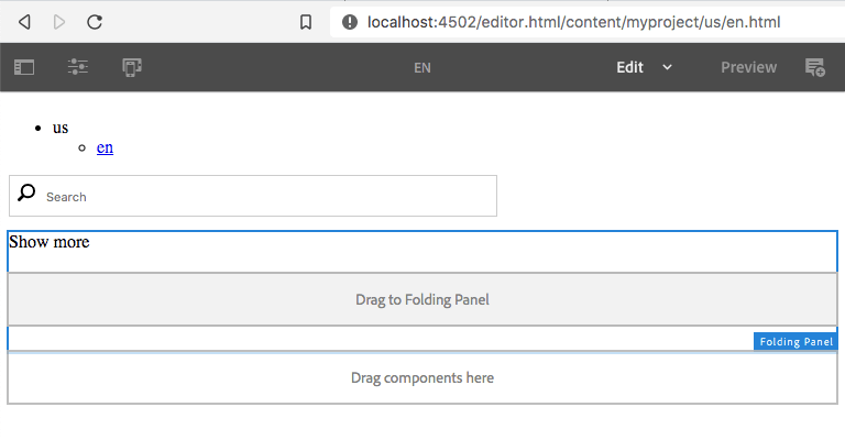
Optionally, create an edit mode only client library to customize the parsys placeholder. This example changes the parsys placeholder text for the folding panel from “Drag components here” to “Drag to Folding Panel”. It also changes its background color slightly to further differentiate it from the other parsys containers.
Client libraries using the
cq.authoring.dialogcategory are included in the global/libs/cq/gui/components/authoring/dialog/clientlibs/all.cssstyle sheet that is used by every site on the instance. Be careful that changes do not adversely affect authoring for other sites.
Create a folder named clientlib-authoring with a css directory in the project’s clientlibs. e.g.,
cd ui.apps/src/main/content/jcr_root/apps/myproject/clientlibs

mkdir -p clientlib-authoring/css
Create a .content.xml with a cq.authoring.dialog category to define the clientlib-authoring folder as an edit mode client library.
.content.xml
<?xml version="1.0" encoding="UTF-8"?>
<jcr:root xmlns:cq="http://www.day.com/jcr/cq/1.0" xmlns:jcr="http://www.jcp.org/jcr/1.0"
    jcr:primaryType="cq:ClientLibraryFolder"
    allowProxy="{Boolean}true"
    categories="[cq.authoring.dialog]"
    dependencies="[granite.utils]"/>
Add this css.txt manifest file to the clientlib-authoring folder.
css.txt
#base=css
overlay-placeholder.less
Add this .less file to the clientlib-authoring/css folder.
css/overlay-placeholder.less
.cq-Overlay--placeholder[data-path*="/foldingpanel/*"] {
  &::before {
    content: "Drag to Folding Panel";
  }
  background-color: #f2f2f2;
}
Install
Deploy the component into AEM.
You can use mvn clean install to build and deploy it. e.g.,
mvn -PautoInstallPackage clean install
AEM Site with folding panel component and text component content.
CSS media queries can be added to show or hide the panel content at various viewport widths.
CSS opacity transitions can also be added to provide a panel content fade in/out effect.
Source Code
Part 2 of 6 in the AEM Component Dev series.