
ADOBE EXPERIENCE MANAGER (AEM) COMPONENTS
Multifield Component
An Adobe Experience Manager (AEM) example to demonstrate development of a component using a composite multifield with a dynamic sling model that accepts a node name parameter.
Features
- A dynamic sling model that returns a list of composite multifield items.
- Background and foreground colors can be changed for each panel by an author using a colorfield.
Getting Started
We’re using a AEM Project Archetype Maven template to create the project.
For example,
cd src

mvn -B org.apache.maven.plugins:maven-archetype-plugin:3.2.1:generate \
 -D archetypeGroupId=com.adobe.aem \
 -D archetypeArtifactId=aem-project-archetype \
 -D archetypeVersion=43 \
 -D aemVersion=6.5.0 \
 -D appTitle="My Project" \
 -D appId="myproject" \
 -D groupId="com.myproject" \
 -D language=en \
 -D country=us \
 -D singleCountry=n \
 -D frontendModule=general
Adobe Experience League Documentation: Using the AEM Project Archetype
MultiField Sling Model
In order to iterate our multifield content nodes in our component’s HTL template, we need a sling model.
Create a sling model in the project’s core/models folder named MultiField.java with the following java code. For example, src/myproject/core/src/main/java/com/myproject/core/models/MultiField.java.
MultiField.java
package com.myproject.core.models;

import org.apache.sling.api.SlingHttpServletRequest;
import org.apache.sling.api.resource.Resource;
import org.apache.sling.models.annotations.Model;

import javax.annotation.PostConstruct;
import javax.inject.Inject;
import java.util.Collections;
import java.util.Iterator;

@Model(adaptables = SlingHttpServletRequest.class, adapters = MultiField.class)
public class MultiField {

	private Iterator<Resource> nodesItemList;

	@Inject
	private String multifieldNodeName;

	@Inject
	private Resource resource;

	@PostConstruct
	public void activate() {
		nodesItemList = Collections.emptyIterator();

		Resource multiFieldNode = resource.getChild(multifieldNodeName);
		if (multiFieldNode != null) {
			nodesItemList = multiFieldNode.listChildren();
		}
	}

	public Iterator<Resource> getItemsList() {
		return nodesItemList;
	}

}
Using this sling model requires a node name parameter to return a list of child nodes. For example, use ${'com.myproject.core.models.MultiField' @ multifieldNodeName='foo'} given this dialog .content multifield field name example ./foo:
<multifield
    jcr:primaryType="nt:unstructured"
    sling:resourceType="granite/ui/components/coral/foundation/form/multifield"
    composite="{Boolean}true">
    <field
        jcr:primaryType="nt:unstructured"
        sling:resourceType="granite/ui/components/coral/foundation/container"
        name="./foo">
        <items jcr:primaryType="nt:unstructured">...</items>
    </field>
</multifield>
Component Folder
Copy the existing helloworld component included with the project to jump start development. For example,
cd src/myproject/ui.apps/src/main/content/jcr_root/apps/myproject/components

cp -a helloworld/. hellomultifield/
Update the jcr:root properties for the hellomultifield component in the hellomultifield/.content.xml as follows.
.content.xml
<?xml version="1.0" encoding="UTF-8"?>
<jcr:root xmlns:cq="http://www.day.com/jcr/cq/1.0" xmlns:jcr="http://www.jcp.org/jcr/1.0"
    jcr:primaryType="cq:Component"
    jcr:title="Hello MultiField Component"
    componentGroup="My Project - Content"/>
Component Dialog
If you copied the helloworld component, you should already have a dialog to start with. Otherwise, create a folder named _cq_dialog in the hellomultifield folder.
The dialog will contain a composite multifield with three fields.
- Text (textarea)
- Background Color (colorfield)
- Color (colorfield)
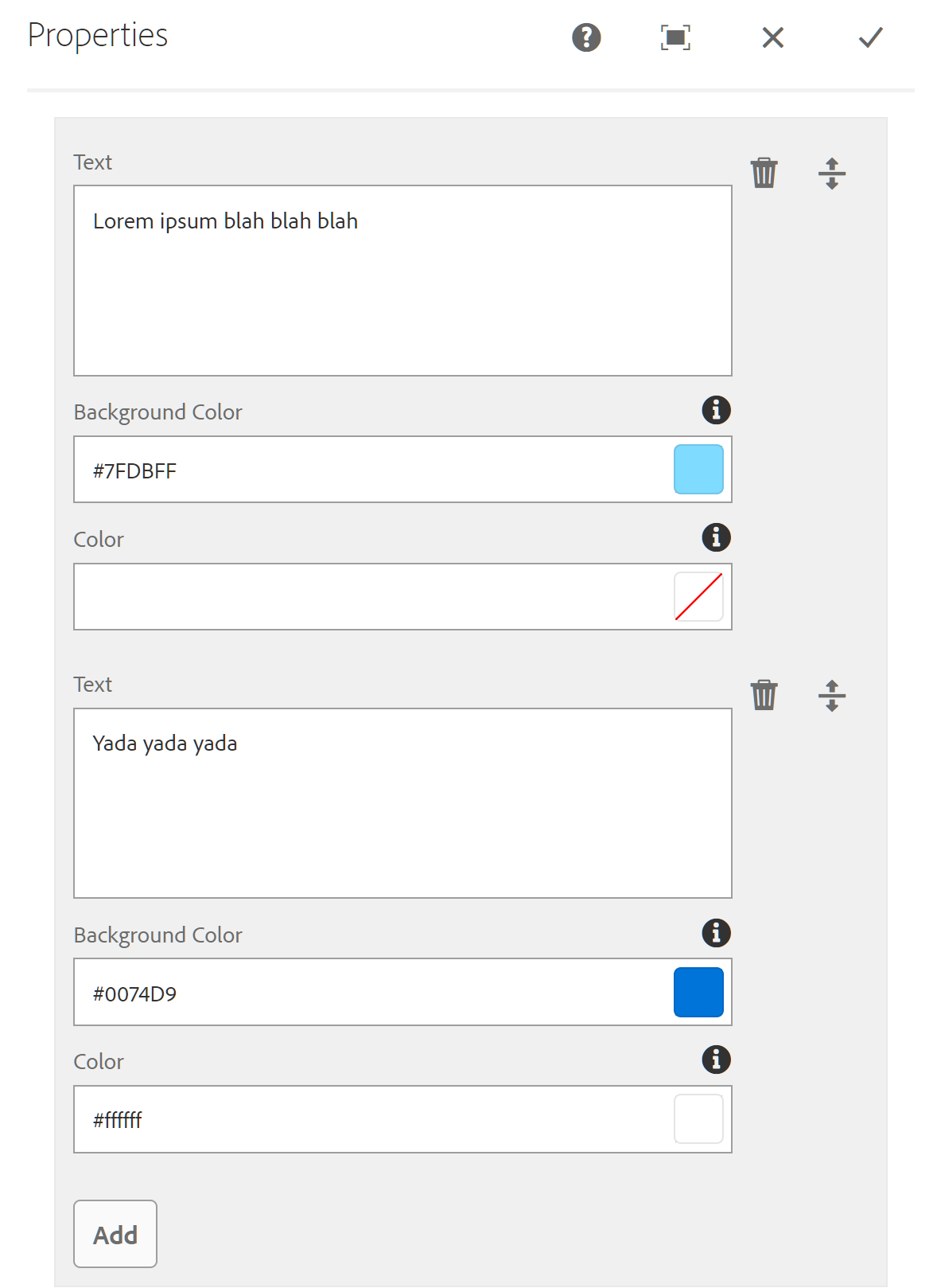
In the _cq_dialog folder, create or overwrite .content.xml as follows using ./panel for our multifield field name.
_cq_dialog/.content.xml
<?xml version="1.0" encoding="UTF-8"?>
<jcr:root
    xmlns:sling="http://sling.apache.org/jcr/sling/1.0"
    xmlns:cq="http://www.day.com/jcr/cq/1.0"
    xmlns:jcr="http://www.jcp.org/jcr/1.0"
    xmlns:nt="http://www.jcp.org/jcr/nt/1.0"
    jcr:primaryType="nt:unstructured"
    jcr:title="Properties"
    sling:resourceType="cq/gui/components/authoring/dialog">
    <content
        jcr:primaryType="nt:unstructured"
        sling:resourceType="granite/ui/components/coral/foundation/fixedcolumns">
        <items jcr:primaryType="nt:unstructured">
            <column
                jcr:primaryType="nt:unstructured"
                sling:resourceType="granite/ui/components/coral/foundation/container">
                <items jcr:primaryType="nt:unstructured">
                    <multifield
                        jcr:primaryType="nt:unstructured"
                        sling:resourceType="granite/ui/components/coral/foundation/form/multifield"
                        composite="{Boolean}true">
                        <field
                            jcr:primaryType="nt:unstructured"
                            sling:resourceType="granite/ui/components/coral/foundation/container"
                            name="./panel">
                            <items jcr:primaryType="nt:unstructured">
                                <text
                                    jcr:primaryType="nt:unstructured"
                                    sling:resourceType="granite/ui/components/coral/foundation/form/textarea"
                                    fieldLabel="Text"
                                    name="./text"
                                    required="{Boolean}false"/>
                                <bgColor
                                    jcr:primaryType="nt:unstructured"
                                    sling:resourceType="granite/ui/components/coral/foundation/form/colorfield"
                                    fieldDescription="Enter a hex value or select a color for the Panel's background."
                                    fieldLabel="Background Color"
                                    name="./bgColor"/>
                                <color
                                    jcr:primaryType="nt:unstructured"
                                    sling:resourceType="granite/ui/components/coral/foundation/form/colorfield"
                                    fieldDescription="Enter a hex value or select a color for the Panel's foreground color. For example, the text color."
                                    fieldLabel="Color"
                                    name="./color"/>
                            </items>
                        </field>
                    </multifield>
                </items>
            </column>
        </items>
    </content>
</jcr:root>
Component Template
In the the hellomultifield component folder, remove helloworld.html and create an hellomultifield.html file as follows.
hellomultifield.html
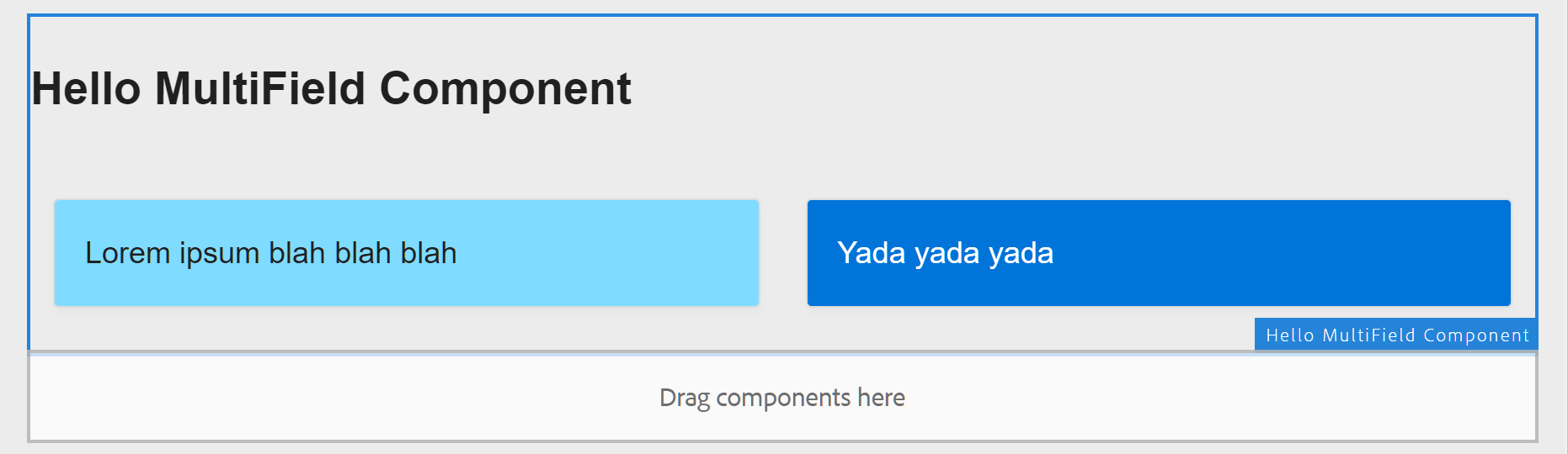
<div class="cmp-hellomultifield" data-cmp-is="hellomultifield">
    <h2 class="cmp-hellomultifield__title">Hello MultiField Component</h2>
    <div data-sly-use.panel="${'com.myproject.core.models.MultiField' @ multifieldNodeName='panel'}"
         data-sly-test="${panel}" class="panel-container"
         data-sly-list.panel="${panel.itemsList}">
         <sly data-sly-set.bgColor="--bgColor:${panel.bgColor ? panel.bgColor : '#fff' @ context='styleToken'};"/>
         <sly data-sly-set.color="--color:${panel.color ? panel.color : 'inherit' @ context='styleToken'};"/>
         <div style="${bgColor @ context='styleString'}${color @ context='styleString'}">${panel.text @ context='html'}</div>
    </div>
</div>
Component Style
To demonstrate different background and foreground color usage, we’re using this scss code for our component markup .panel-container.
In the src/myproject/ui.frontend/src/main/webpack/components/ folder, create a Sass file name _hellomultifield.scss with the following code.
.cmp-hellomultifield {
    .panel-container {
        display: flex;
        flex-wrap: wrap;
        justify-content: space-between;
        padding: 0.5em 0 0.75em;

        > div {
            display: block;
            border: 1px solid #dcdcdc;
            border-radius: 3px;
            box-shadow: 0 2px 4px #e6e6e6;
            flex-basis: 18.5em;
            flex-grow: 1;
            margin: 0.75em;
            padding: 1rem;
            position: relative;
            background-color: var(--bgColor);
            color: var(--color);
        }
    }
}
Install
You can use mvn clean install to build and deploy it. e.g.,
mvn -PautoInstallPackage clean install
Source Code
Part 5 of 6 in the AEM Component Dev series.