
ADOBE EXPERIENCE MANAGER (AEM) COMPONENTS
Button Component
An Adobe Experience Manager (AEM) example to demonstrate development of extending the core button component to allow an image to be added from the AEM Digital Asset Manager (DAM) and an option to open a button link in a new tab.
Getting Started
As a best practice for AEM projects, we’re using a Maven project archetype for this. Since we’re not modifying or creating any Java classes for this, you could develop the component directly in CRXDE Lite if you prefer, but this is not recommended.
Button Component
Copy the core button component template into your projects button component folder.
Core button component template: /apps/core/wcm/components/button/v1/button/button.html
Using git, clone the aem-core-wcm-components repo onto your local computer to inspect and copy its source into your project as needed.
In our copy of the button template, update the path to use the core component icon template since we’re not copying or modifying icon.html. e.g.,
button.html
...
<button data-sly-use.button="com.adobe.cq.wcm.core.components.models.Button"
        data-sly-use.component="com.adobe.cq.wcm.core.components.models.Component"
        data-sly-use.iconTemplate="/apps/core/wcm/components/button/v1/button/icon.html"
        ...
        >
...
</button>
Note that the ellipsis
...in the code snippet above is not a part of the actual code and is there only to denote code that is being skipped and not applicable to the example.
Before we begin to modify the button component, deploy the updated button.html to your AEM server to verify that it is working on a page. If needed, the code deployment page has more information on how to deploy code to your AEM server.
Image Tab
The first modification we will make is the addition of an image tab in the button dialog to allow an author to add an image from the DAM that will render within the button components element.
In order to modify the dialog we need to copy it from the core button component. For this step, I will copy the button/_cq_dialog folder from the aem-core-wcm-components repo source into my project. You could copy the respective /apps/core/wcm/components/button/v1/button/cq:dialog and paste it into your projects button component within AEM using CRX/DE if you prefer, but I find it easier to work with and maintain on my local file system. For example, using CRX/DE to edit the cq:dialog and add the image tab, nodes and properties is not the same as opening button/_cq_dialog/.content.xml in your code editor.
In this example, I will copy the _cq_dialog folder from the aem-core-wcm-components repo and paste it into ui.apps/.../jcr_root/apps/myproject/components/button/
After the accessibility node, insert the following image node in our copy of the dialog .content.xml.
_cq_dialog/.content.xml
...
<image
    jcr:primaryType="nt:unstructured"
    jcr:title="Image"
    sling:resourceType="granite/ui/components/coral/foundation/container"
    margin="{Boolean}true">
    <items jcr:primaryType="nt:unstructured">
        <columns
            jcr:primaryType="nt:unstructured"
            sling:resourceType="granite/ui/components/coral/foundation/fixedcolumns"
            margin="{Boolean}true">
            <items jcr:primaryType="nt:unstructured">
                <column
                    jcr:primaryType="nt:unstructured"
                    sling:resourceType="granite/ui/components/coral/foundation/container">
                    <items jcr:primaryType="nt:unstructured">
                        <fileupload
                            jcr:primaryType="nt:unstructured"
                            sling:resourceType="cq/gui/components/authoring/dialog/fileupload"
                            allowUpload="{Boolean}false"
                            autoStart="{Boolean}false"
                            class="cq-droptarget"
                            fieldLabel="Image"
                            fileNameParameter="./fileName"
                            fileReferenceParameter="./fileReference"
                            mimeTypes="[image/gif,image/jpeg,image/png,image/webp,image/svg+xml]"
                            multiple="{Boolean}false"
                            name="./fileName"
                            title="Upload an image asset:"
                            uploadUrl="${suffix.path}"
                            useHTML5="{Boolean}true"/>
                        <altText
                            jcr:primaryType="nt:unstructured"
                            sling:resourceType="granite/ui/components/coral/foundation/form/textfield"
                            fieldDescription="The alt text attribute value for the image."
                            fieldLabel="Alt Text"
                            name="./altText"/>
                    </items>
                </column>
            </items>
        </columns>
    </items>
</image>
...
For the image to render, we need to update our button.html. e.g.,
after
<sly data-sly-call="${iconTemplate.icon @ icon=button.icon}"></sly>
add
<span data-sly-test="${properties.fileReference}"
      class="cmp-button-img">
    <img src="${properties.fileReference}"
         alt="${properties.alt}"/>
</span>
Deploy the updated button component to the AEM server.
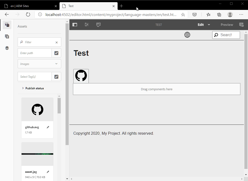
Using the updated dialog, add an image from the DAM to verify that it is working.
 Demo of button component extended to allow an image from the DAM to be shown.
Open Link in New Tab
In this step, we’re adding a switch to the dialog form to allow an author to choose to open button links in a new tab or window.
After the link node in the properties tab, insert the following linkTarget node in our button component dialog .content.xml.
_cq_dialog/.content.xml
...
<linkTarget
    jcr:primaryType="nt:unstructured"
    sling:resourceType="granite/ui/components/coral/foundation/form/switch"
    fieldLabel="Open the link in a new tab or window?"
    name="./linkTarget"
    uncheckedValue="{Boolean}false"
    value="{Boolean}true"/>
...
At the very top of template, above the button element, add the following sightly expression to set a linkTarget variable.
button.html
<sly data-sly-set.linkTarget="${properties.link && properties.linkTarget == 'true' ? '_blank' : ''}"/>
...
When the switch to open button link in new tab is on, as a best practice, we’re adding the rel="noopener" attribute to the link in addition to the target="_blank" attribute.
In button element, below the href attribute, add the rel and target attributes. These attributes will only be rendered if they are not empty.
button.html
...
<button data-sly-use.button="com.adobe.cq.wcm.core.components.models.Button"
        data-sly-use.component="com.adobe.cq.wcm.core.components.models.Component"
        data-sly-use.iconTemplate="/apps/core/wcm/components/button/v1/button/icon.html"
        data-sly-element="${button.link ? 'a' : 'button'}"
        type="${button.link ? '' : 'button'}"
        id="${component.id}"
        class="cmp-button"
        href="${button.link}"
        rel="${linkTarget == '_blank' ? 'noopener' : ''}"
        target="${linkTarget}"
        aria-label="${button.accessibilityLabel}"
        data-cmp-clickable="${button.data ? true : false}"
        data-cmp-data-layer="${button.data.json}">
...
</button>
Deploy the updated button component to the AEM server.
Using the updated dialog, add a link and test it with and without the switch set to open the link in a new tab or window to verify that it is working.
 Demo of button component extended with a switch to toggle open link in a new tab.
Source Code
Part 4 of 6 in the AEM Component Dev series.